|
Originally I was making this project with my dog but after putting all the images together they really didn’t fit. One reason was that to get him to go to places on the stairs I had to throw treats while trying to keep one vantage point. After I scratched that plan I asked my sister if shed move him around outside while I take pictures but she insisted there be clones of her so this is what I ended up with. There were still definitely problems because it was so bright I could barely see my screen as well as she was changing outfits so it means I had to sit there in one place for even longer. The second picture is an example of a pose I had to sadly throw away because the lighting and quality was so off. If I could change anything it would definitely have taken that 2nd picture again because I had to improvise and put a person that already was in the picture in its place. 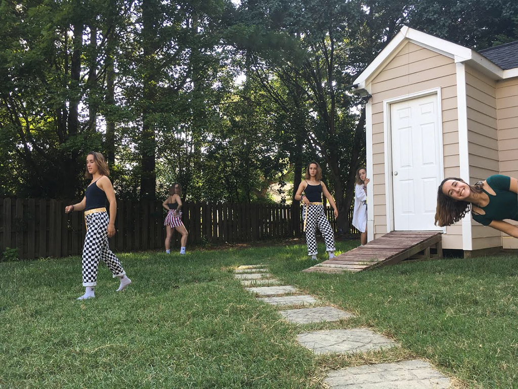 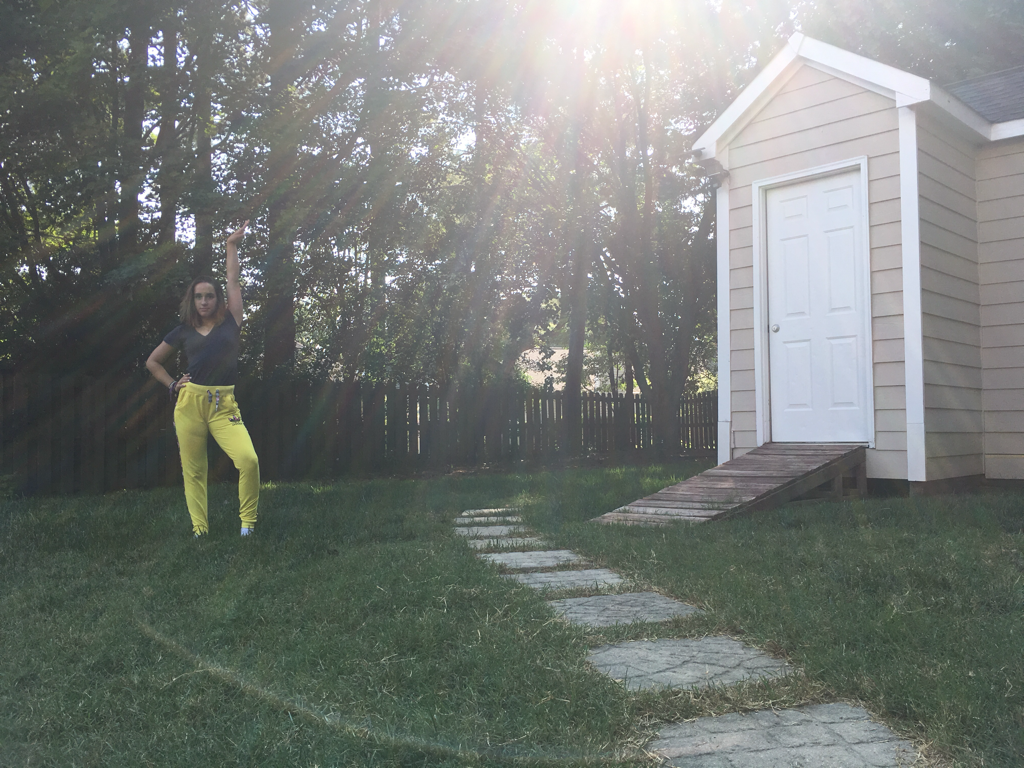
0 Comments
My portrait is of my best friend Katy :) I use this picture so that’s why her lips are blue in the art. 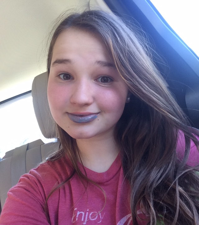 Draft: 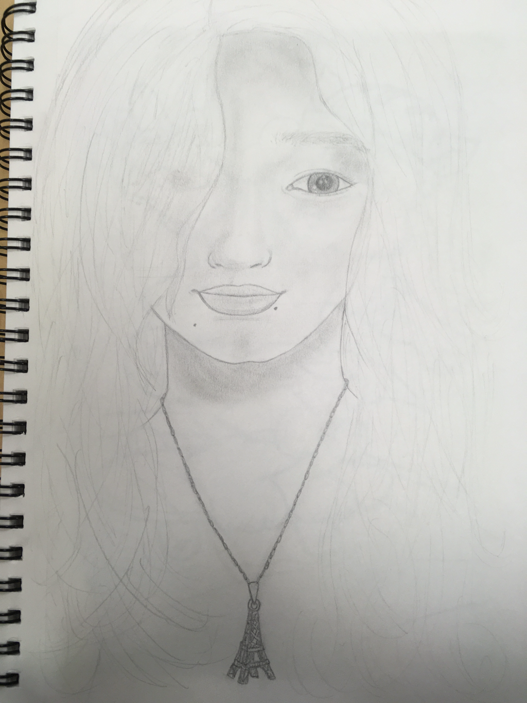 I decided to do it in watercolor 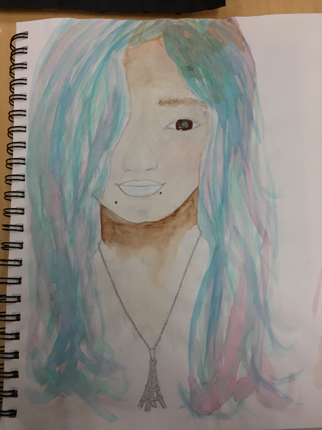 Final in progress: 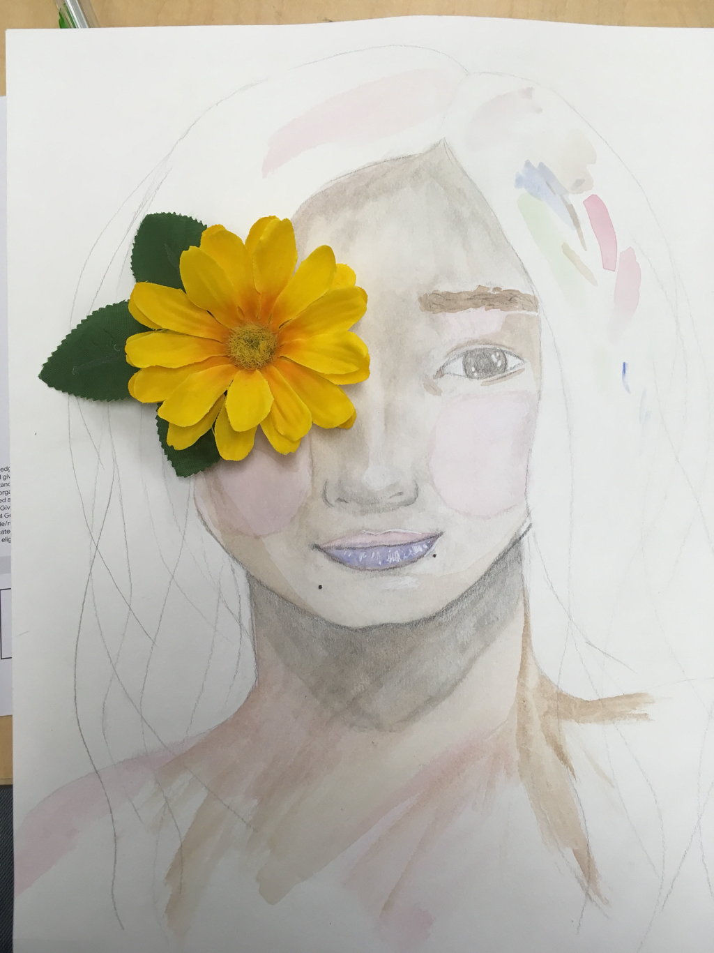 In this piece I used • watercolor • pencil • silk flowers • white gel pen • black pen • hot glue 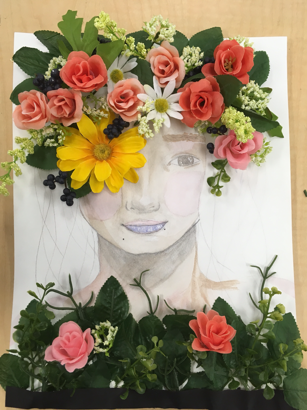 I decided to leave the hair in pencil so it didn’t distract from the flowers. First I sketched out the outline next I did watercolor base on the face when that dried I added the details (eyes mouth) after that dried I did the pen work then my favorite part was adding the flowers for which some of them I poked holes and some went directly on the paper using hot glue lastly I trimmed it up a bit and then I was done 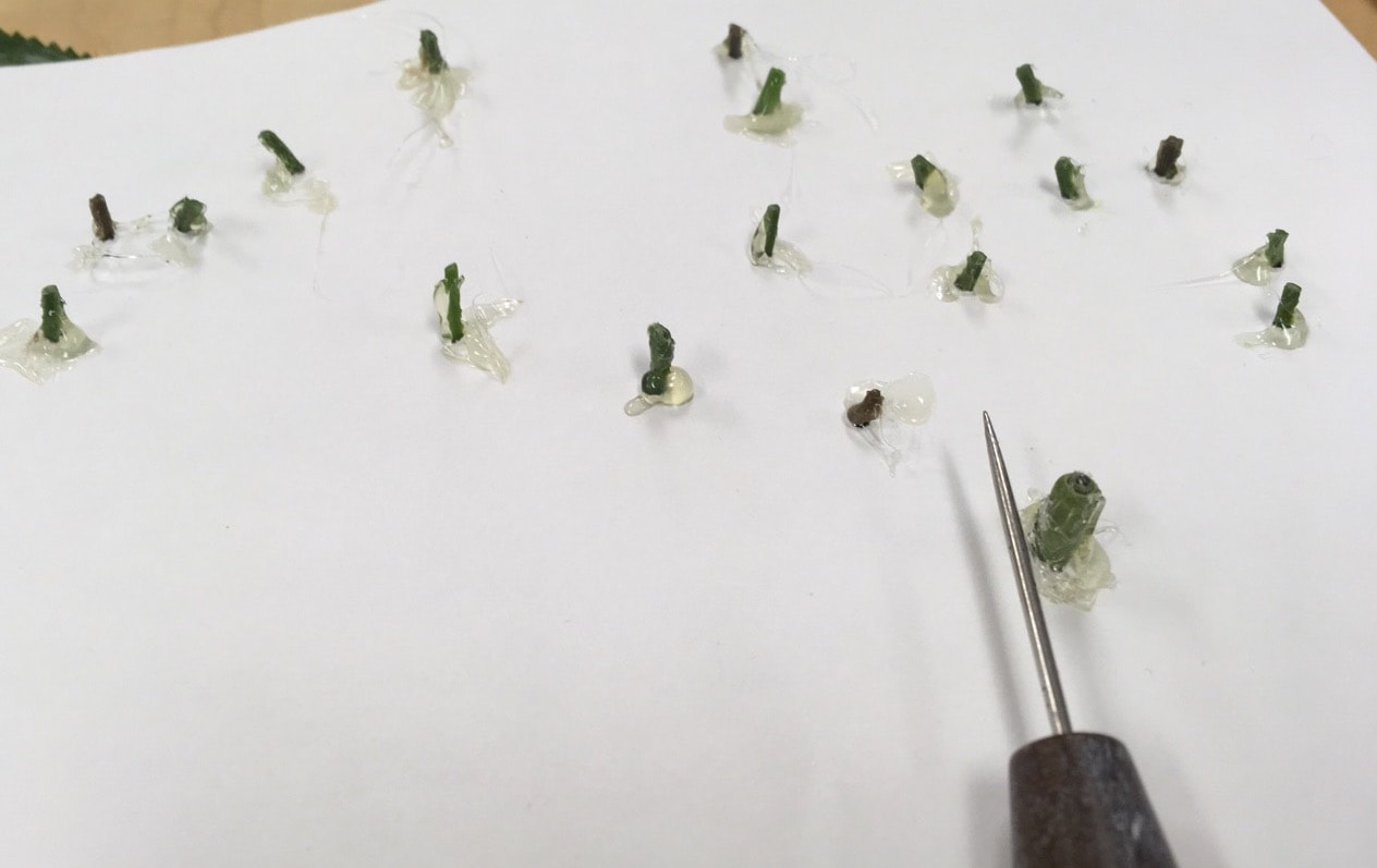 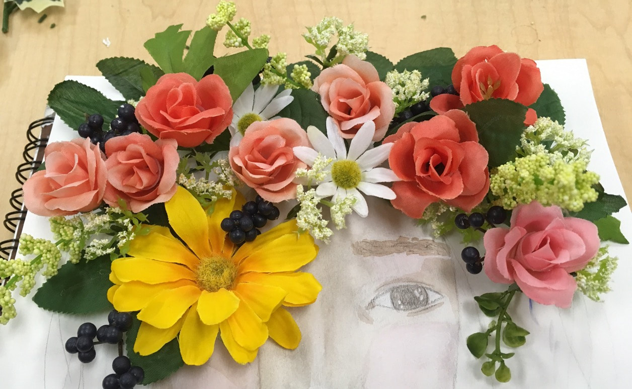 My process for criticizing art is looking at it without bias. This is difficult in that sometimes you can’t see what others do see, or you get so sick of the piece after working on it for so long. I also try to look at it one piece at a time so I can give a better overall criticism. Writing lists helps me to organize my thoughts and judgments.  At the time of finishing this piece I thought it was the "best thing ever". I'm not saying that it is terrible but it definitely needs work. Now looking at it I can see flaws like: • the eye creases are weird and out of place • the outlining of the petals defeats the purpose of the exercise and the lines are too thick • the piece by the bridge of the nose is too dense • not sure what’s happening with the dark spots near either side of the eye Before this I had never done this style so it was fun to learn a new technique. WHAT IS ART?: A lot of people don’t consider things like this (character design) to be art. I thing art if a perception and what works for one person may not translate to another. Art doesn’t even have to have a meaning or be thought provoking it can just be a sketch or it can be a full marble sculpture. The varying types of art is what makes it fun because there are no restrictions. You create and there is bound to be someone who likes or is impressed by your art. When you look back at drawings you did as a kid they look really bad now but at one point your brain told you what you did was good. Your art will always be improving because over time you can learn to fix previously made. Art is a work in progress.  WHAT WARM UP OR SKETCHBOOK ASSIGNMENT DID YOU LEARN THE MOST FROM: (#8) The hand assignments and watercolor were my favorite. I learned how to work with water color and to draw what I saw instead of what I know (even though I had no idea how to draw hands). Over the warm ups I could see improvements. My dad always is trying to get me to draw hands because it is something that I really struggle with and end up putting hands behind the back so this warm up gave me more confidence in drawing hands and using watercolor which has quickly become my favorite medium. 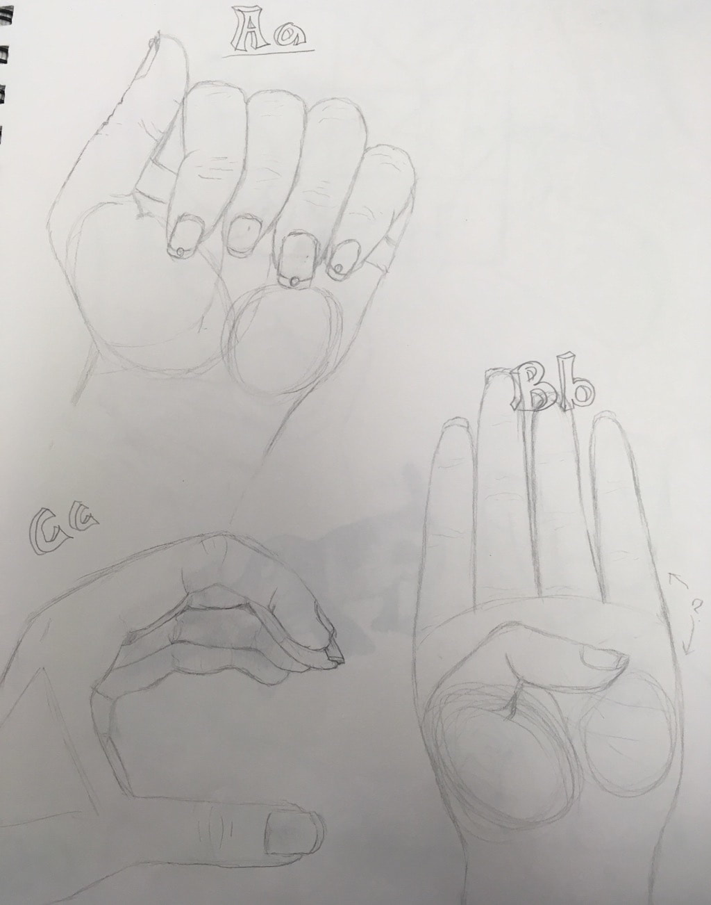 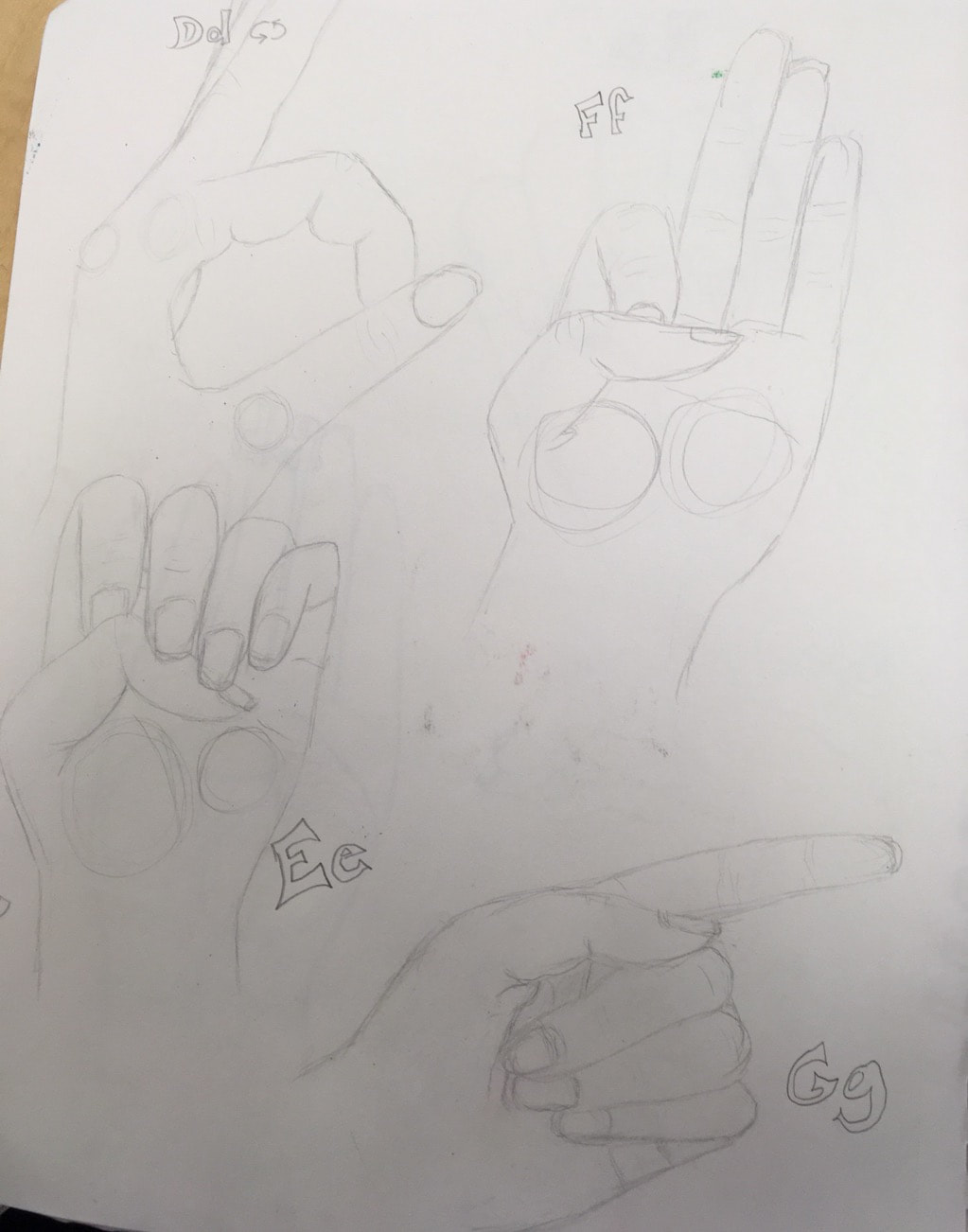 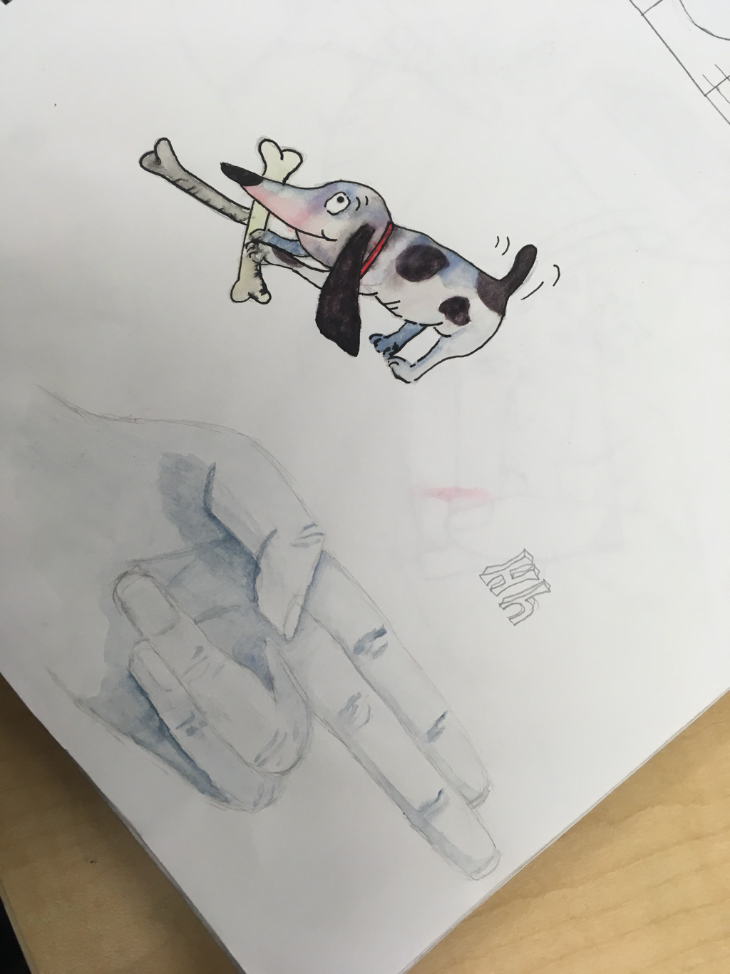 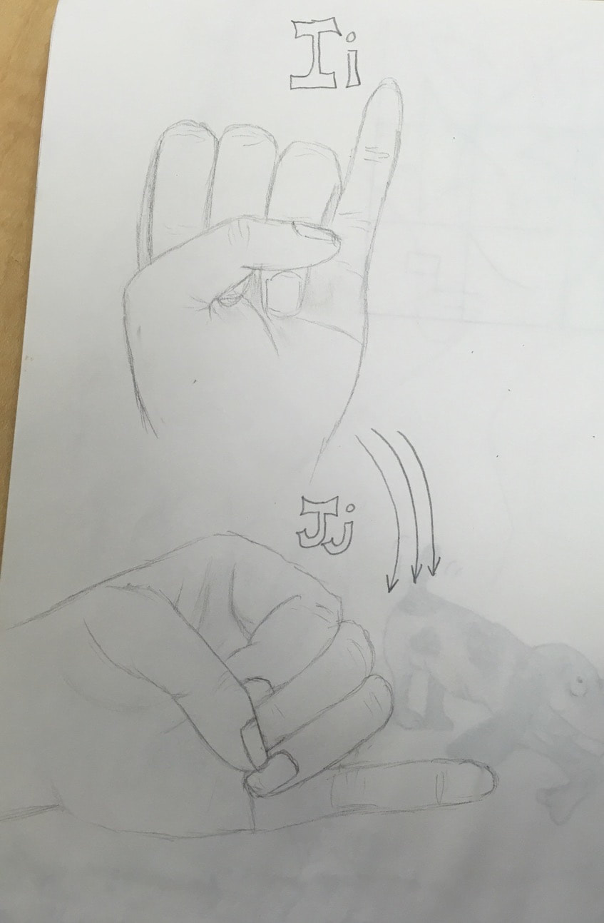 ILLUSTRATION FRIDAY: (#9) I think this exercise challenged me to be creative and think of things in ways not obvious. Sometimes I have a lot of trouble coming up with idea so having a week to brainstorm and draw made it so there was pressure but not too much to where it was scary. Over time I can see improvement on composition and overall attractiveness of the pieces. I think that i will continue to do illustration friday so i can keep the creative pressure.  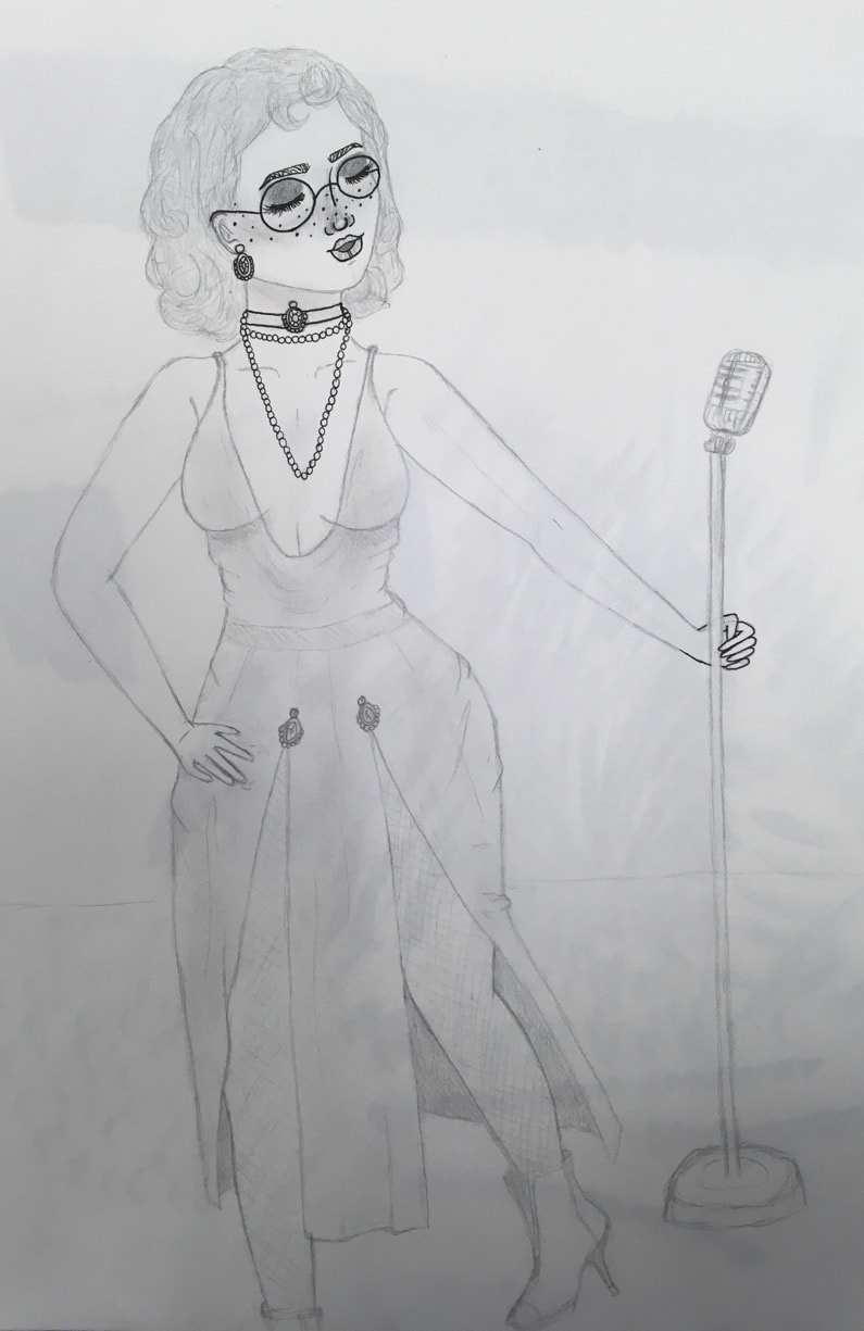 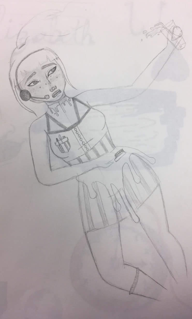 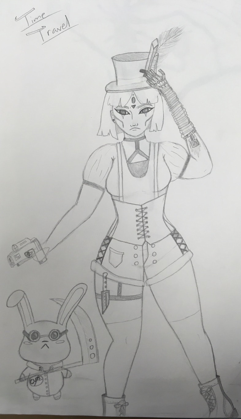 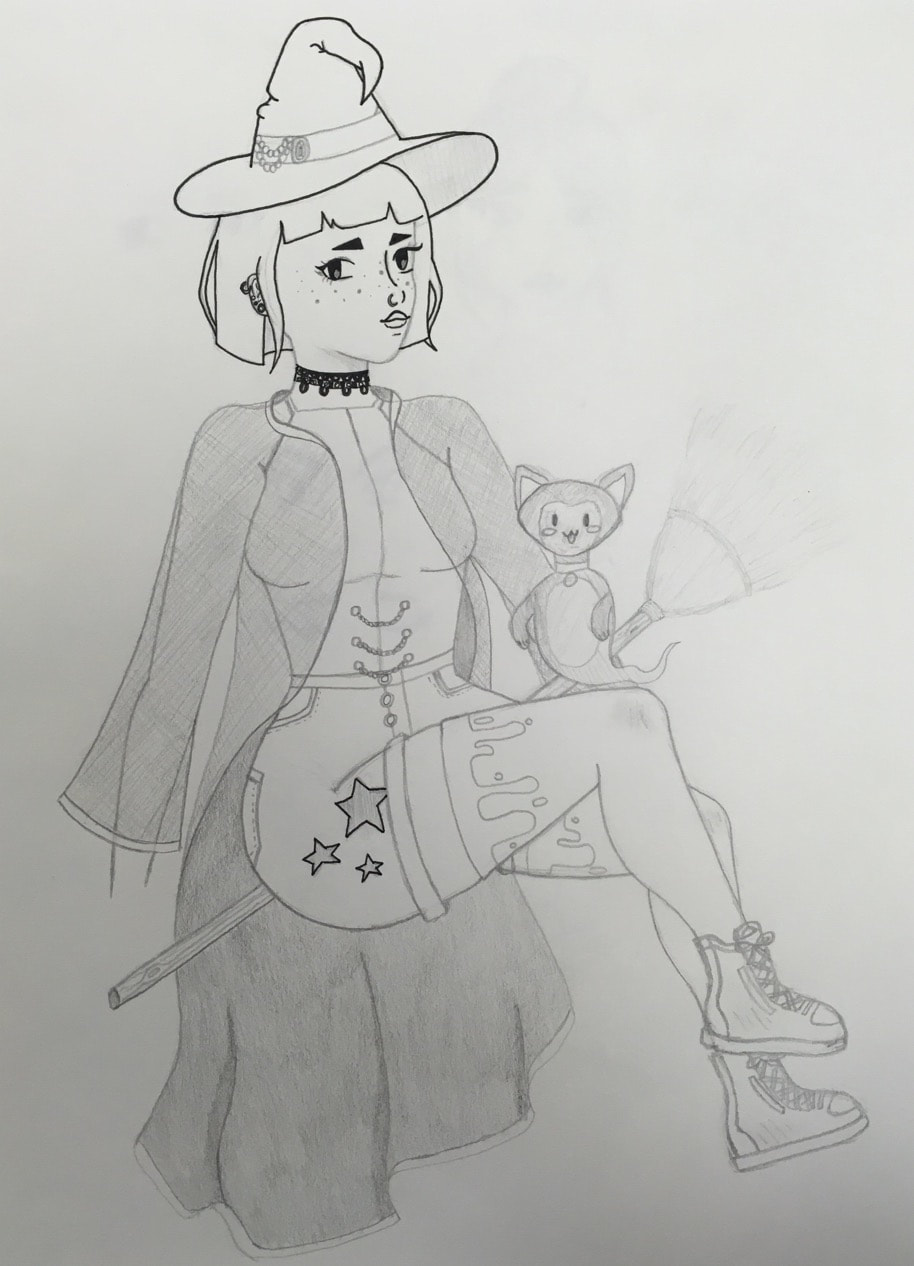     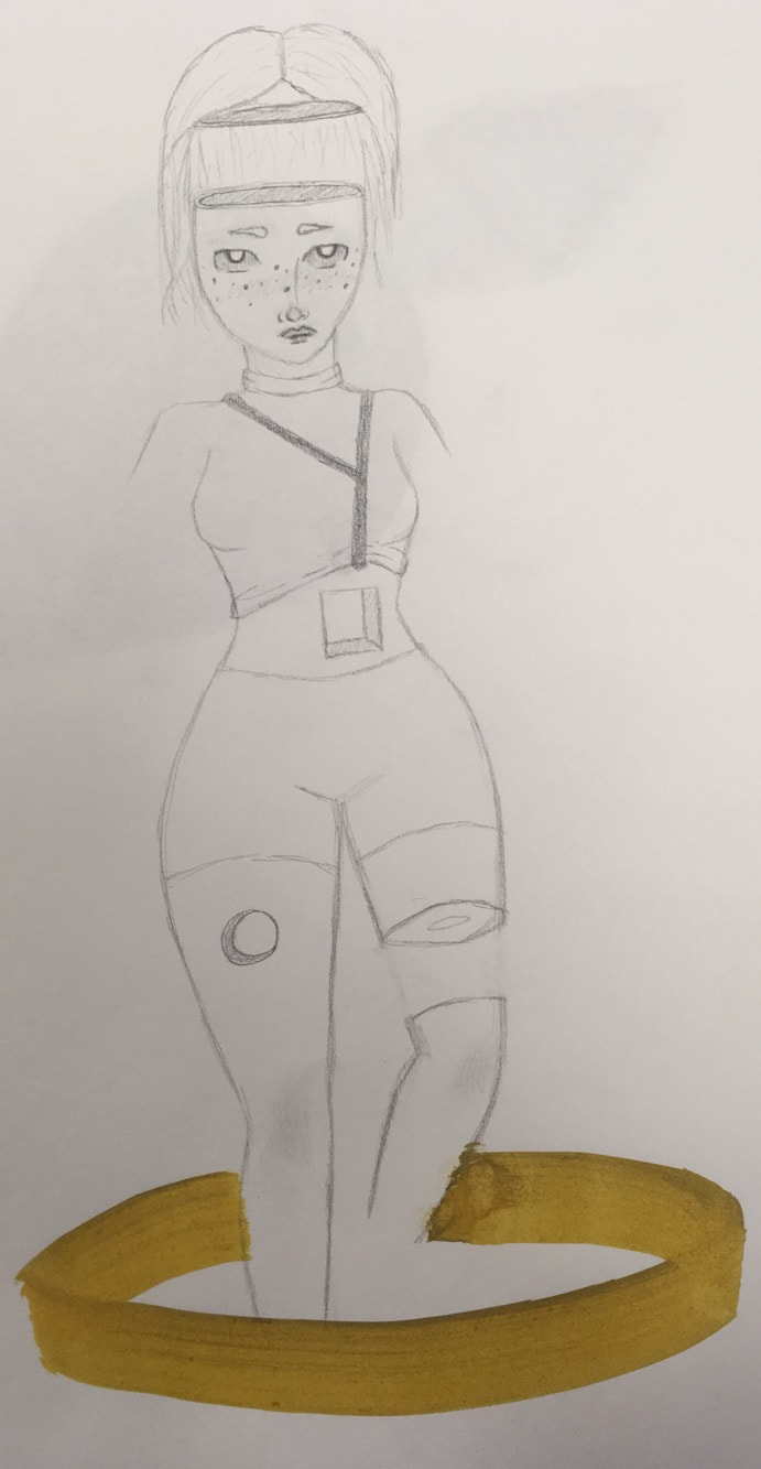 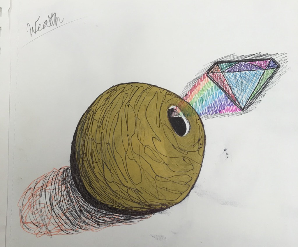 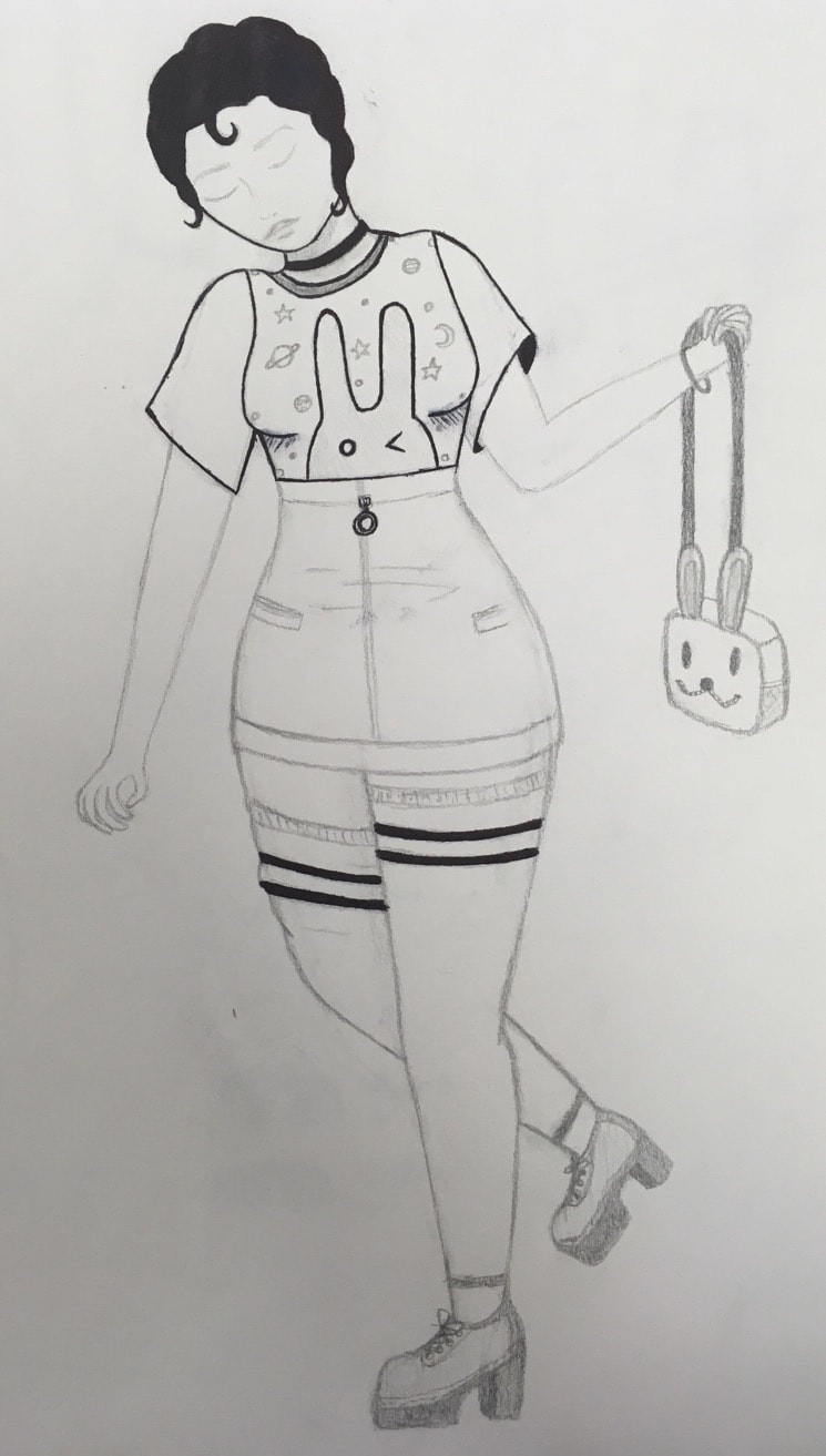 Which Project Would You Redo? (#16) If I were to redo a project i would redo my linocut piece. My first draft (below) I was trying to do a doodled look but i didn't like it so I toned it down but I should have completely restarted and not gone with what I had. Also other people did jellyfish so I would have liked to do something different. This project was one of my favorites because I had never tried anything like this before and it really is a fun way to make art (and it's reusable). Another thing I would do differently is use a different color ink or paper because black and white looks ok but it could be more interesting. I have learned from this project that it is better to use bigger shapes and lines which I did not and it made it much harder. It also taught me how to see backwards and what i care won't be inked. This was a good experience and I hope to try this medium again. 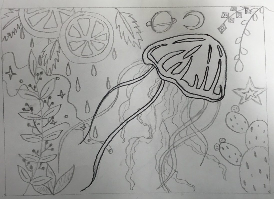 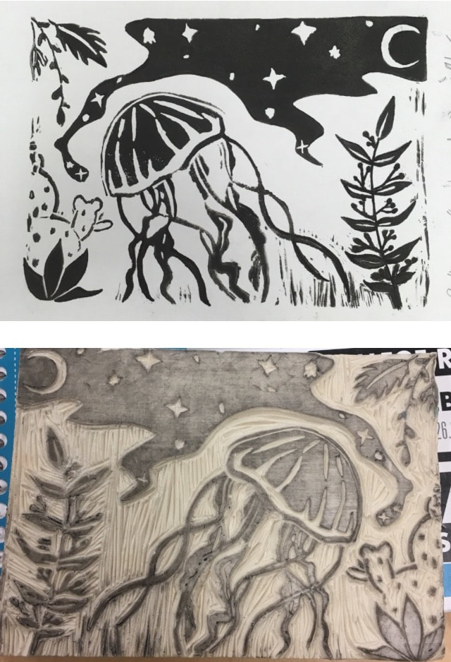 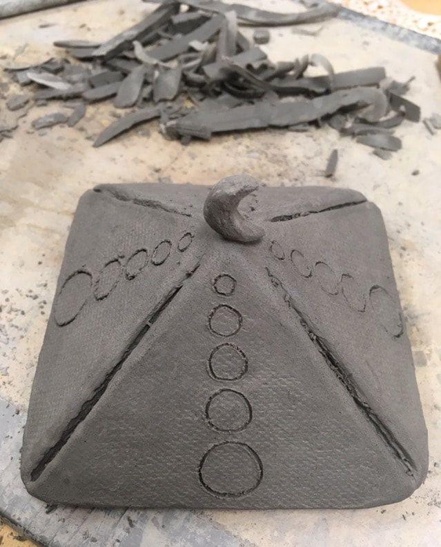 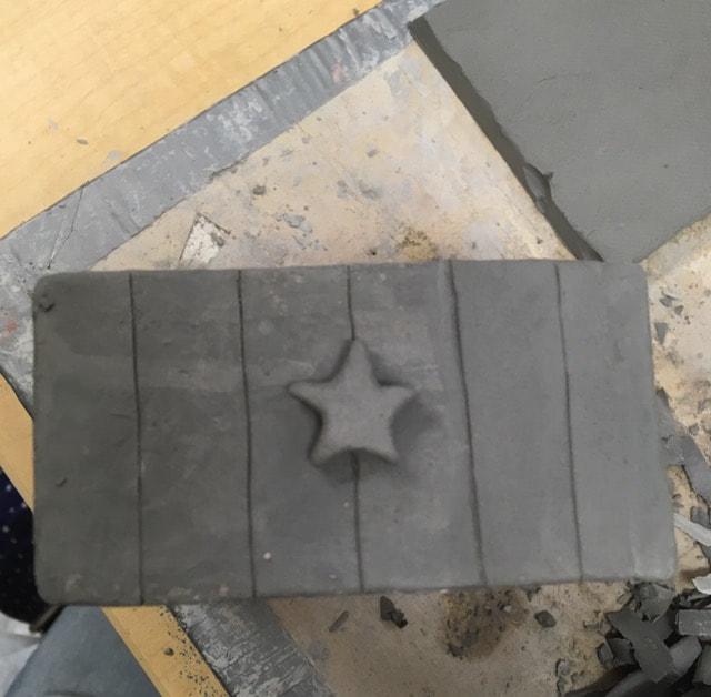 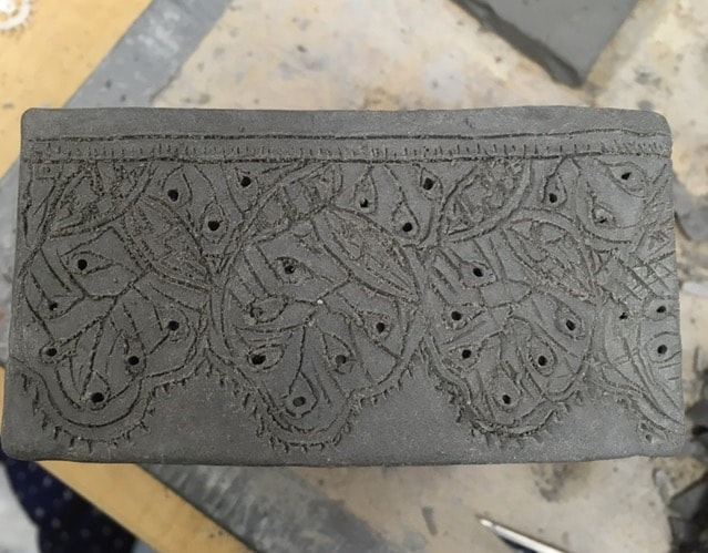 For this piece I am planning on using acrylic paint instead of glaze. By doing this I hope to have more color choice. I’m planning to finish it with a non heated glaze so it still has that shiny smooth finish.
The most difficult thing I have found to keep happening it that it keeps collapsing even if it seems secure. I think what was most successful for me was making the little sculptures like the moon on top and the star on the side. I decided to cut my slabs to make a small square box. To put it together I used the scratch and slip technique even though it gave me some trouble. I used only black glaze for certain pieces on the box and did an initial fire without glaze on the rest so I could do it in acrylic. 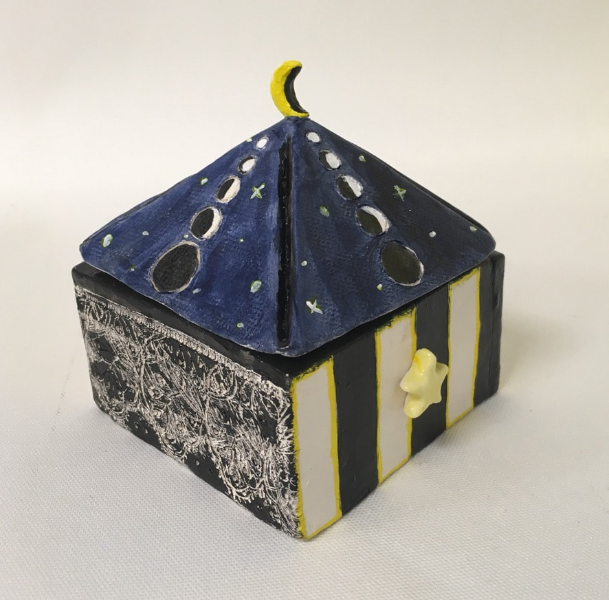 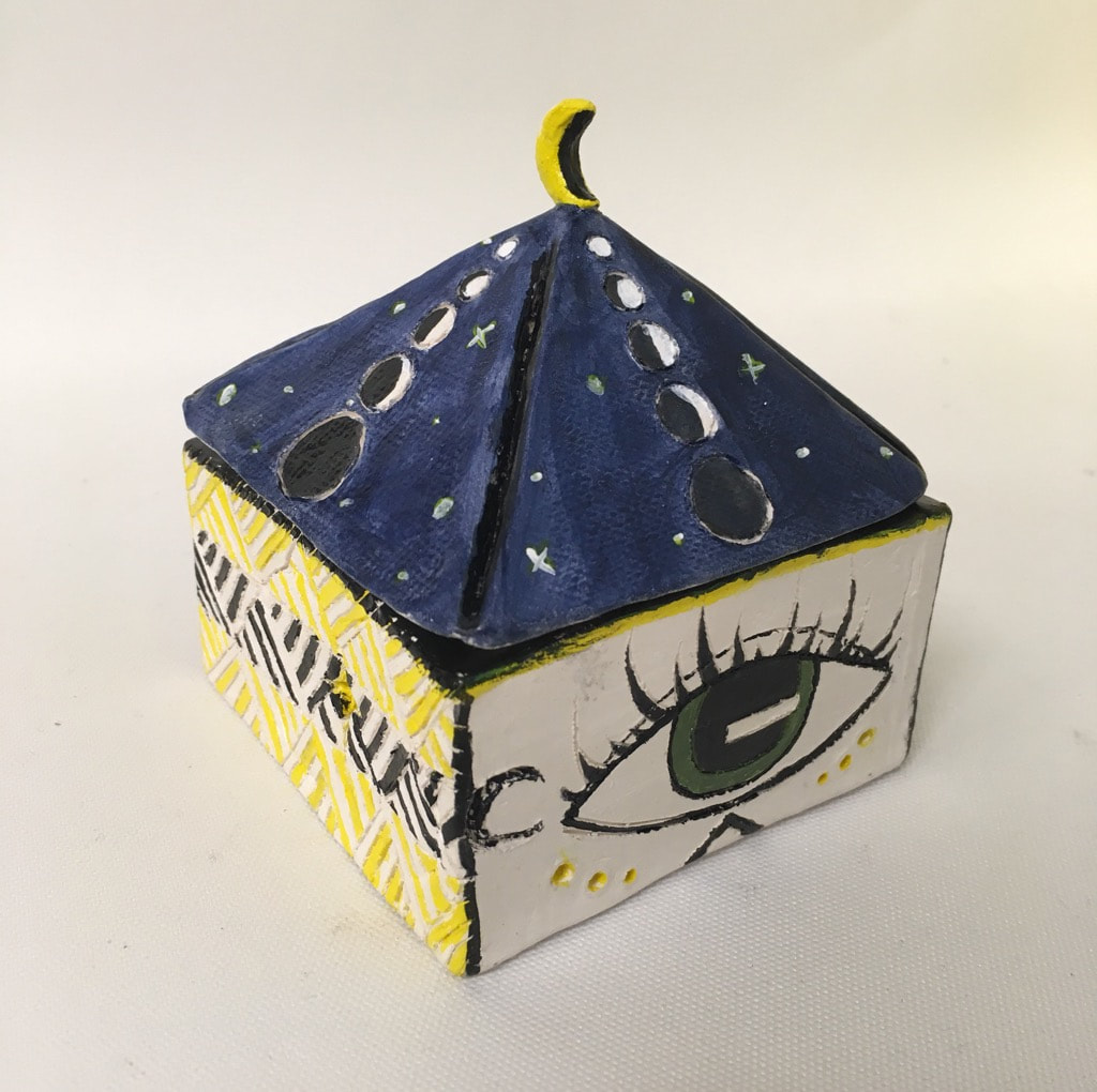 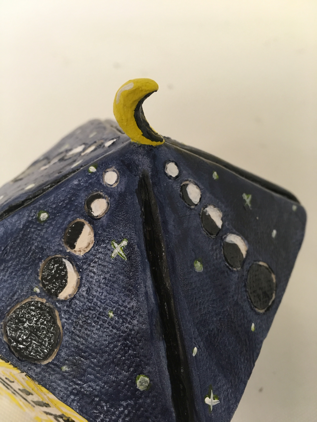 Since last time I have finished the acrylic painting and used the non fire glaze. I think it was successful in making something that can function as a box and I also like the design. If I were to do it again I would be more particular about my pieces so they would fit together better and wouldn’t be so uneven. I would also plan out my design better so it is more cohesive.
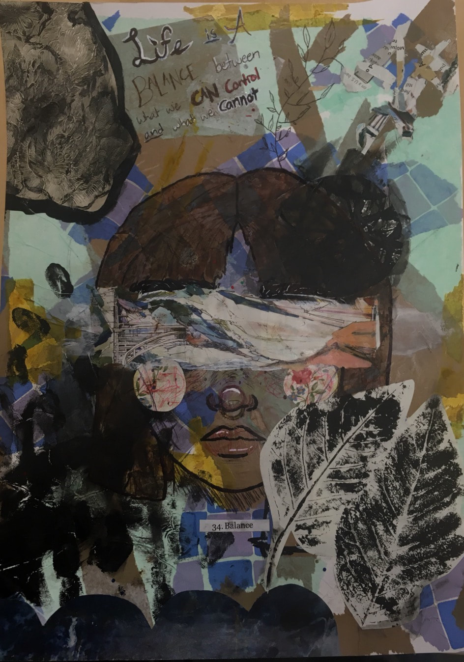 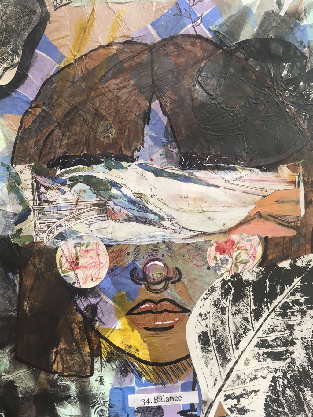 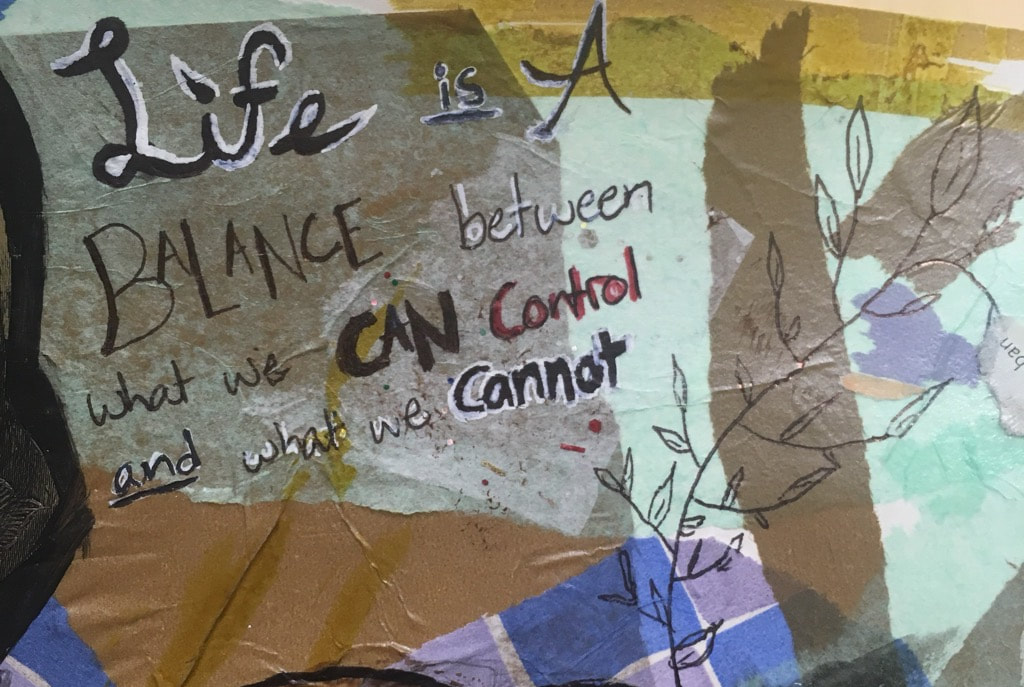 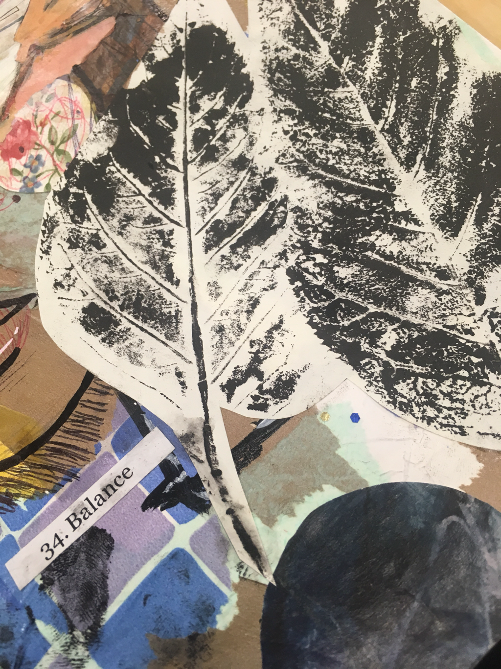 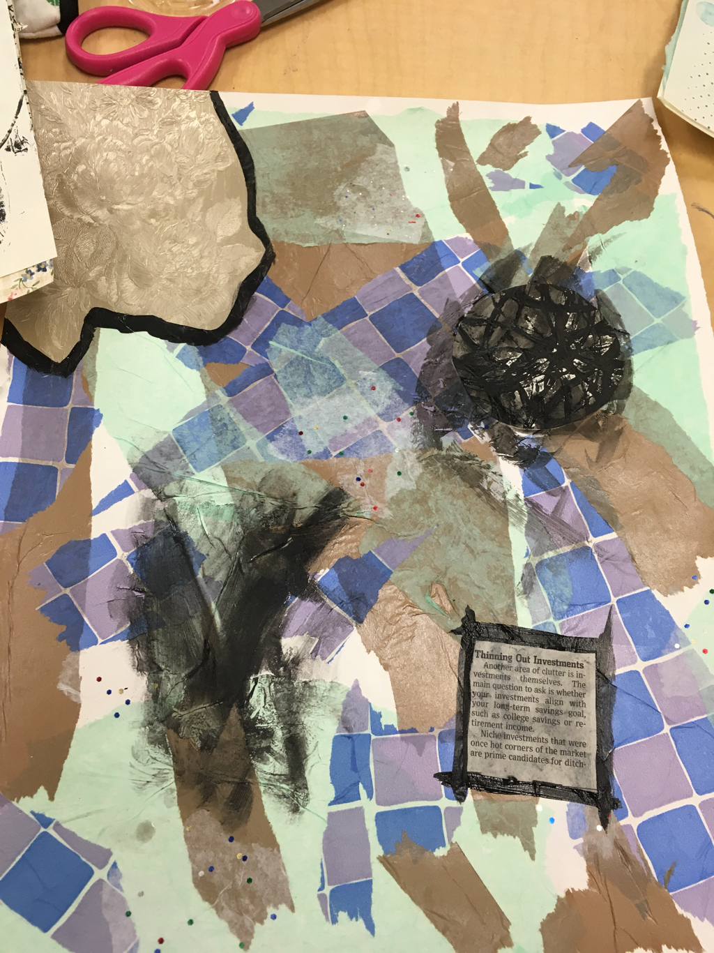 My word was balance and I chose to use a quote and a repeating double design throughout the piece. Mediums/Techniques: 1) tissue paper 2) gold marker 3) black paint (smudging+ with a brush) 4) floral paper (cheeks and corner) 5) printed paper (leaves and circle) 6) magazine (over eyes and remains from that in corner, scallops on bottom) 7) pen (black and red for face and plant near quote, hair lines) 8) sharpie ( outline of hair, lips, nose, eyebrows, and some letters) 9) white paint previously covering eyes 10) brown watercolor (hair) 11) prompt paper (balance) 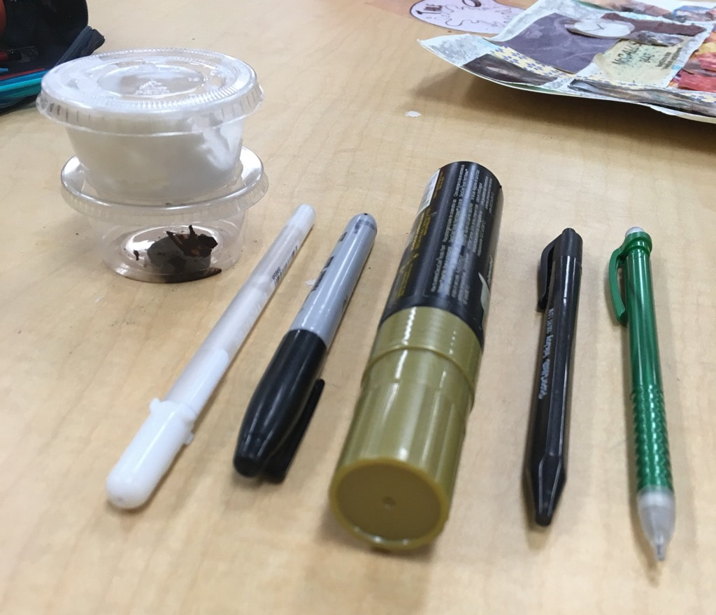 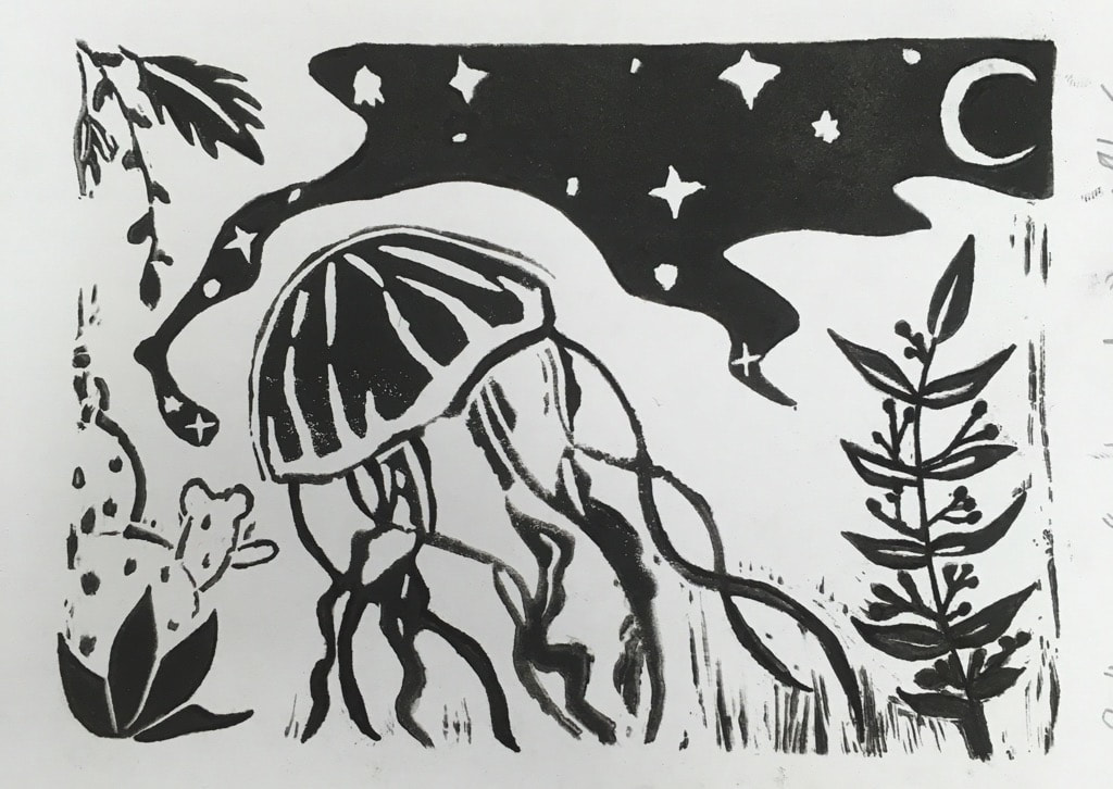 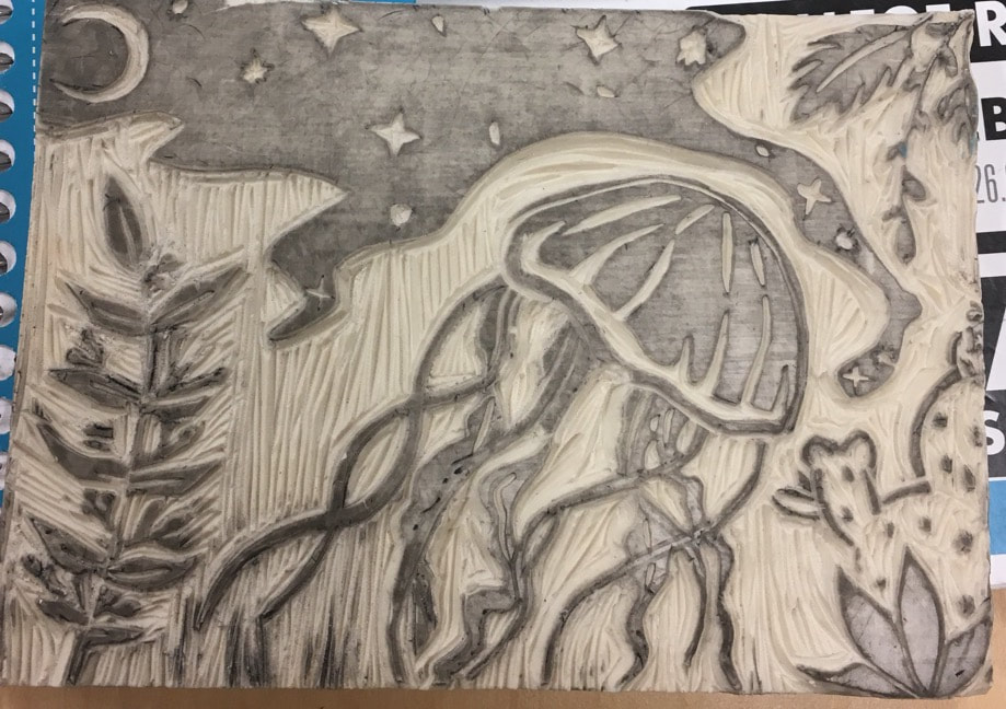 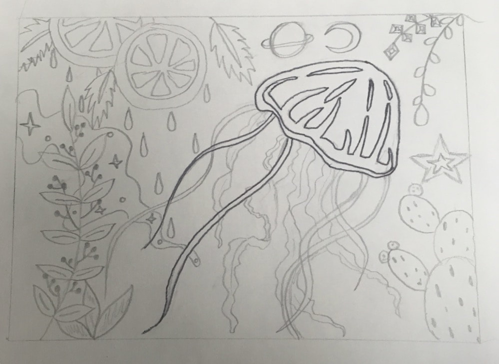 I used lines to cut and create shape to a block. I think my piece was successful in creating a picture that shows what I was looking for. If I were to do this again I would like to plan out what would be black and what would be white. i also would like to choose something not so cartoon like to use the ability of texture in the piece.
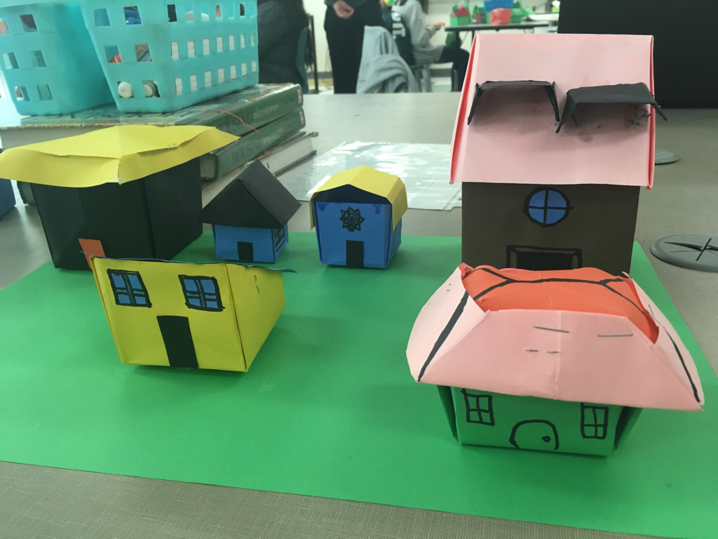
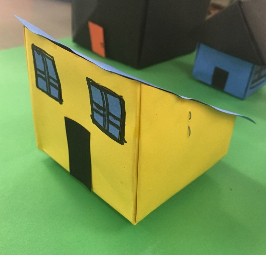
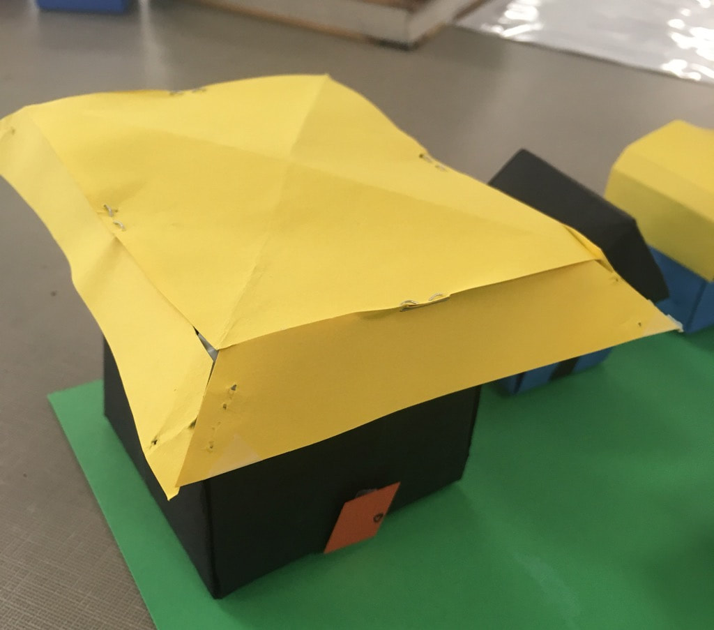
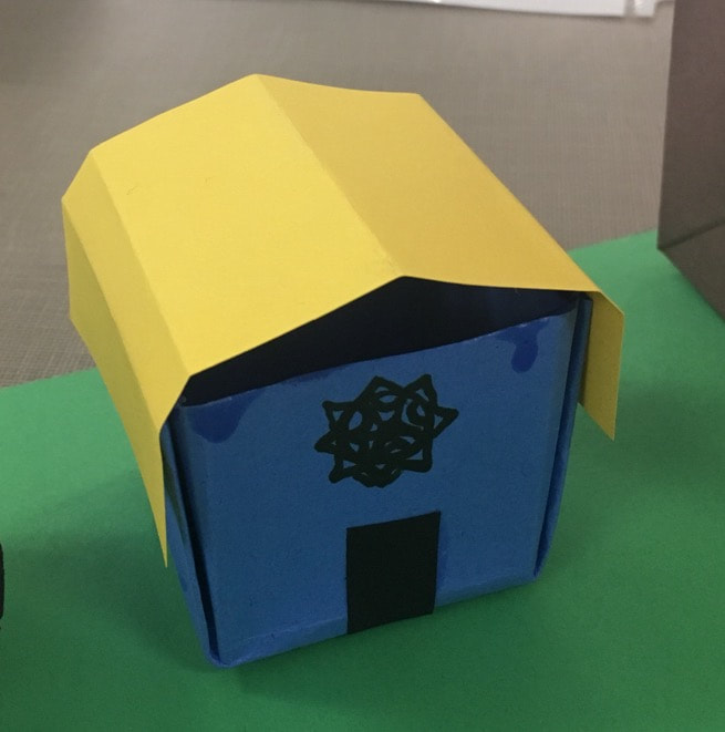
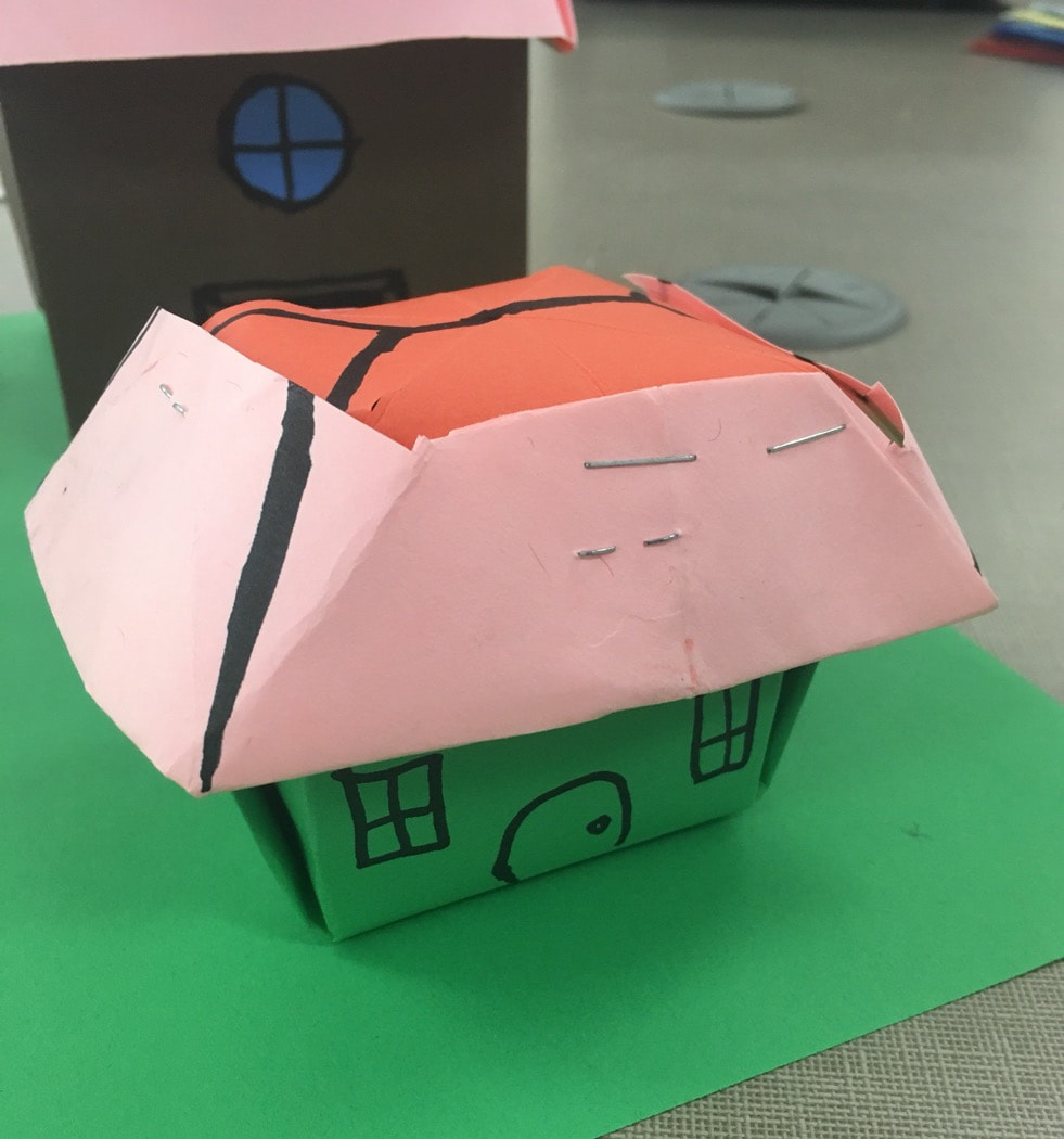
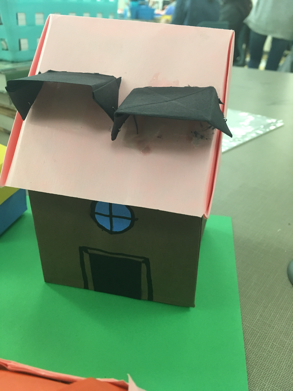
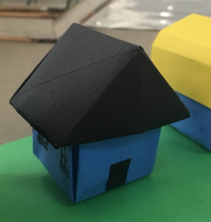
Living Room 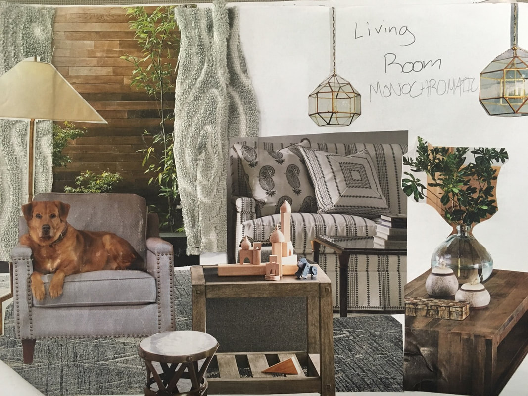 Dining room 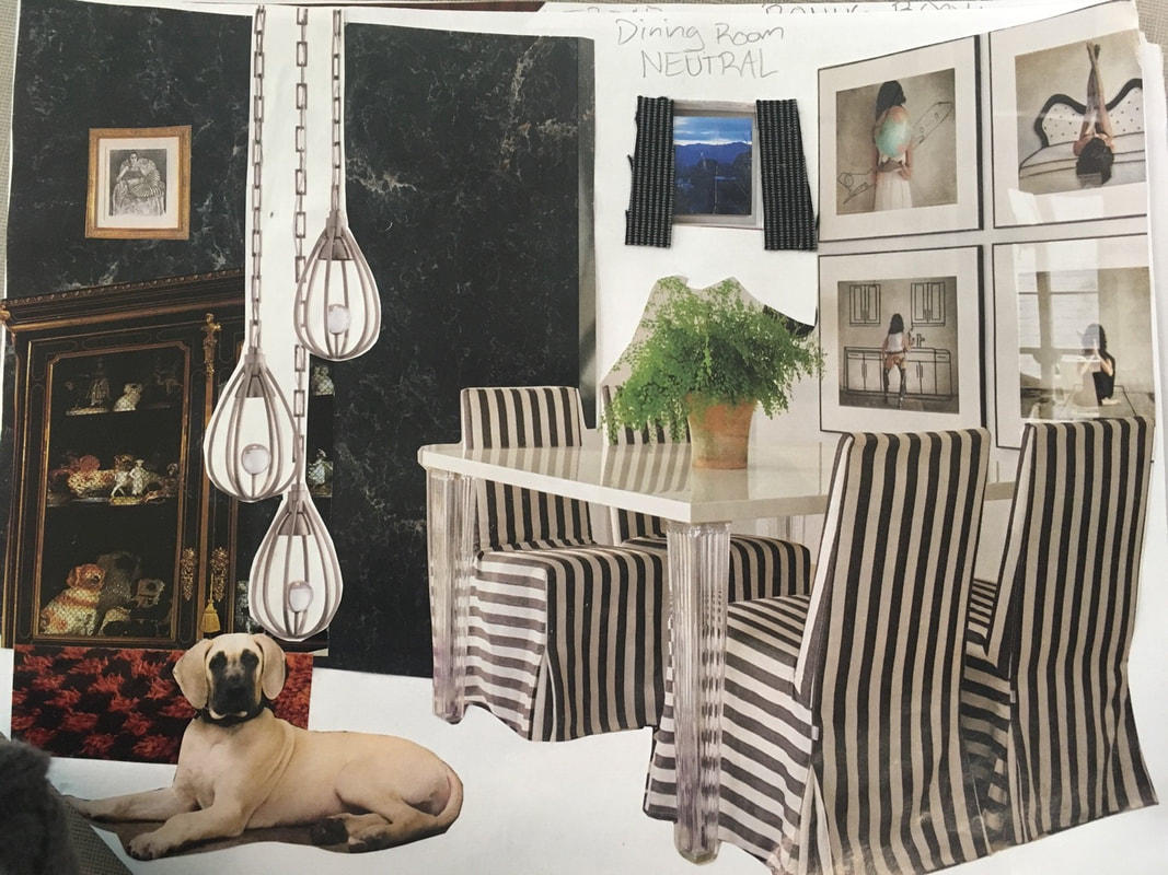 These two I felt I did the best on. In every room I decided to put a dog and I think it adds to the home effect.
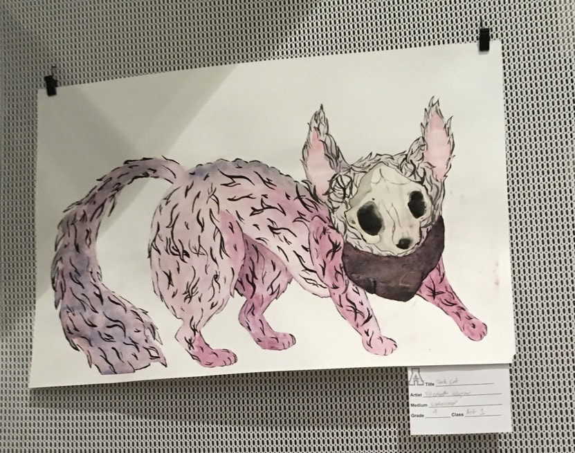 In progress- 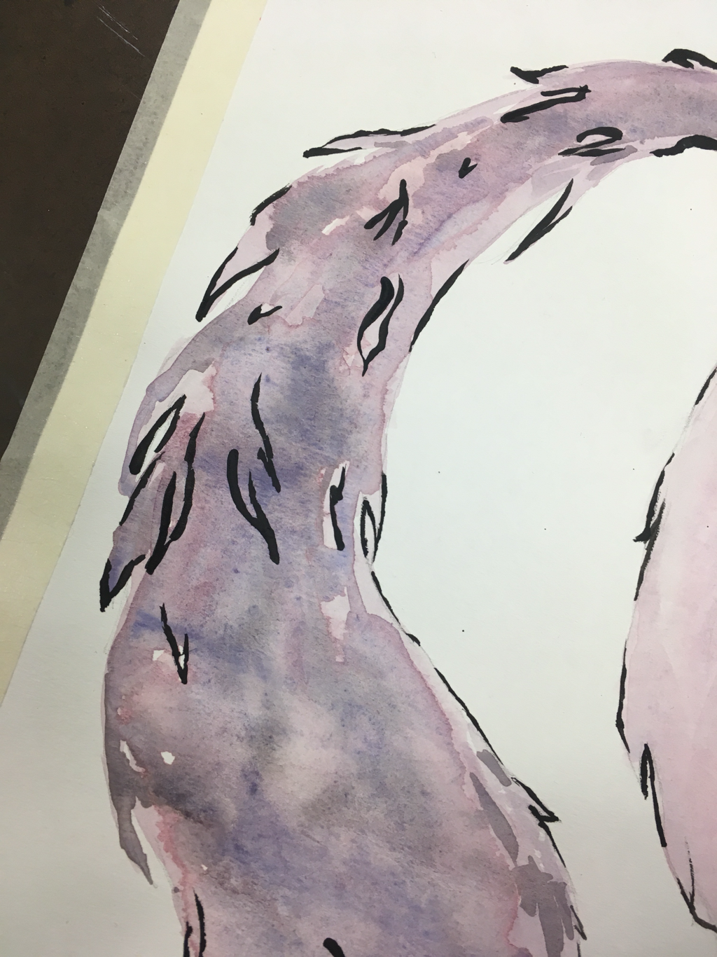 I think the most helpful warm up was the watercolor from the children’s book because it helped me to understand blending colors 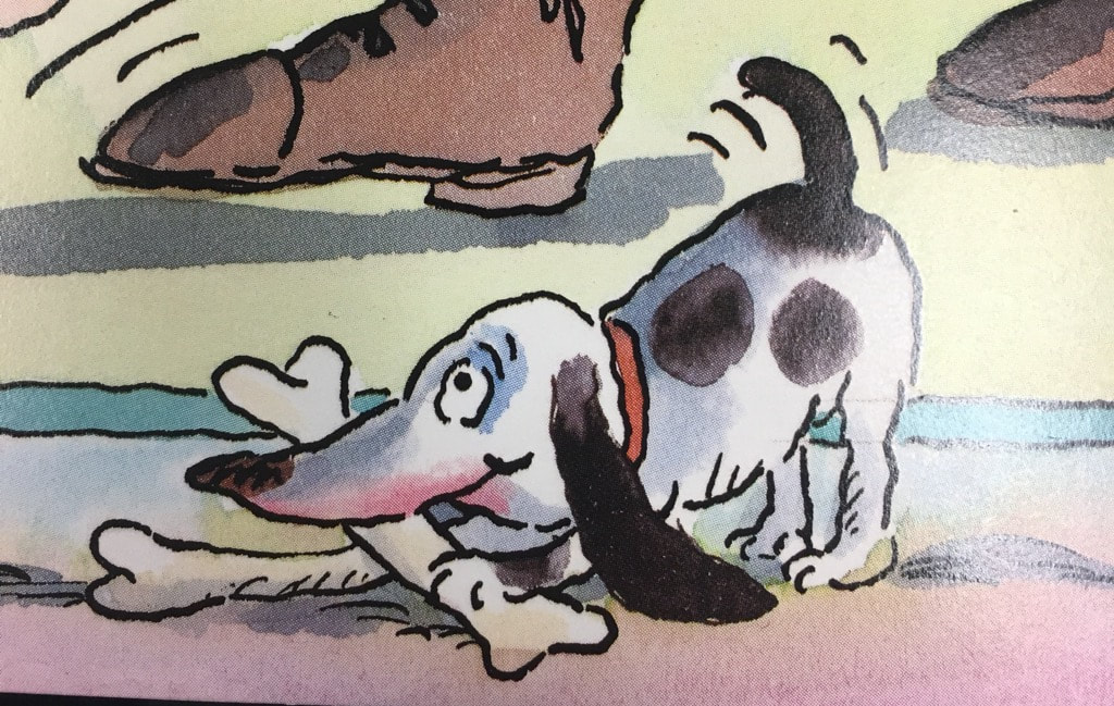 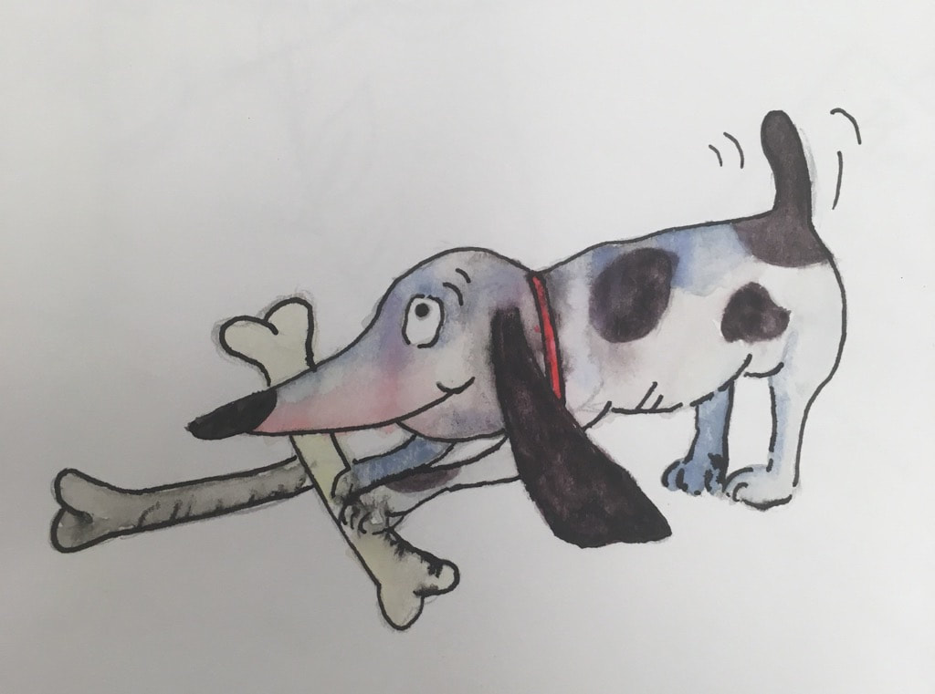 Mind Map- 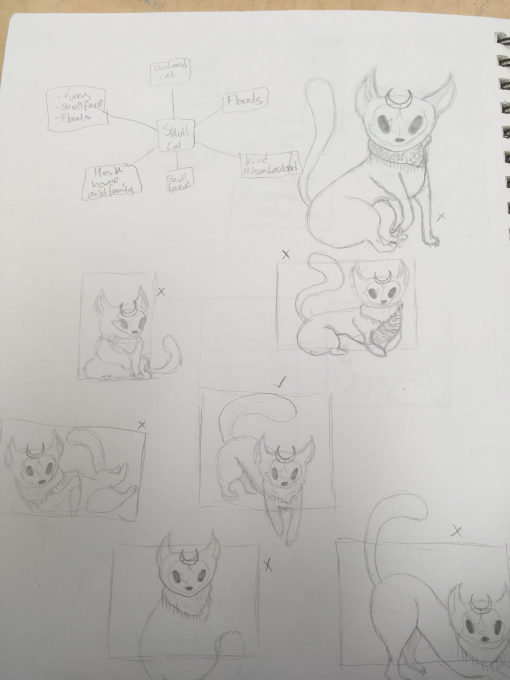 I used this character that was just a picture on Pinterest that I found interesting 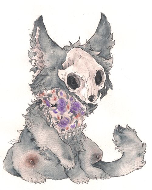 My version is not as well done but I used a lot more black lines and more of a purple than grey
My favorite way to watercolor is to blend by adding while it’s still wet I think it gives it more depth and shading/texture. I think that watercolor differs between different people because it is such a free art form but I would advise to not use too much water because it will wear away the color and move too easily |
 RSS Feed
